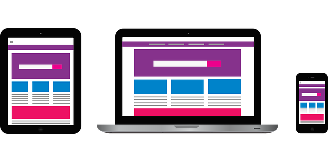
CSS Grid has revolutionized web design by providing a powerful and flexible layout system that allows for the creation of sophisticated, responsive blog post layouts. This tool enables designers to arrange content in a visually appealing and organized manner, enhancing the user experience and making information easily accessible. By leveraging CSS Grid, web developers can create layouts that adapt seamlessly to various screen sizes, ensuring that blogs look great on both desktops and mobile devices. This article delves into the practical applications of CSS Grid in designing engaging blog post layouts, backed by real examples, tools, and current trends in web design.
The Basics of CSS Grid
CSS Grid is a two-dimensional layout system that allows web designers to create complex layouts with ease. Unlike traditional layout methods like floats and flexbox, CSS Grid enables the placement of elements in rows and columns, providing greater control over the overall design. According to a 2023 survey by the State of CSS, CSS Grid has seen widespread adoption among web developers, with over 80% of respondents using it in their projects. The system’s popularity is driven by its simplicity and power, allowing designers to create both simple and intricate layouts without extensive code.
Setting Up Your Grid
To get started with CSS Grid, you need to define a grid container and specify the number of rows and columns. This can be done using the `display: grid` property on a container element. For instance, you can create a basic grid with three columns using the following code:
“`css .container { display: grid; grid-template-columns: repeat(3, 1fr); } “`
This code sets up a container with three equal-width columns. You can also define the size of each column and row explicitly, providing precise control over the layout. By combining these techniques, designers can create a wide variety of grid structures to suit their needs.
Placing Items on the Grid
Once the grid structure is defined, you can place items on the grid using the `grid-column` and `grid-row` properties. These properties allow you to specify the starting and ending positions of each item, enabling complex layouts with ease. For example, you can create a layout where an image spans two columns while the accompanying text occupies a single column:
“`css .image { grid-column: 1 / 3; }
.text { grid-column: 3 / 4; } “`
This flexibility is one of the key advantages of CSS Grid, allowing designers to create dynamic and responsive layouts that adapt to different content types and screen sizes.
Creating Engaging Blog Post Layouts
Designing an engaging blog post layout involves more than just arranging content; it requires a deep understanding of user behavior and design principles. By using CSS Grid, designers can create visually appealing and easy-to-navigate layouts that enhance the reader’s experience. One effective technique is to use a grid-based layout for the blog’s main content and a separate grid for the sidebar, ensuring that both sections are well-organized and visually distinct.
Responsive Design with CSS Grid
Responsive design is crucial in today’s multi-device world, and CSS Grid excels in creating layouts that adapt to various screen sizes. By using media queries, designers can adjust the grid layout based on the device’s screen size, ensuring that content is displayed optimally on desktops, tablets, and smartphones. For example, you can change the number of columns in the grid for different screen sizes:
“`css @media (max-width: 768px) { .container { grid-template-columns: 1fr; } }
@media (min-width: 769px) { .container { grid-template-columns: repeat(3, 1fr); } } “`
This approach ensures that the blog layout remains user-friendly and visually appealing, regardless of the device being used.
Integrating Modern Design Trends
In 2024, minimalist designs, bold typography, and vibrant color schemes are popular trends that can be easily incorporated using CSS Grid. Minimalist designs focus on simplicity and functionality, reducing clutter and enhancing readability. Bold typography draws attention to key content, while vibrant color schemes create a visually stimulating experience. By integrating these trends with the flexible layout capabilities of CSS Grid, designers can create contemporary blog layouts that captivate readers.
Practical Examples and Tools
Several tools and frameworks can assist in designing blog post layouts with CSS Grid. One popular tool is Grid by Example, a collection of grid layout examples that demonstrate various use cases and techniques. This resource, created by Rachel Andrew, a leading expert in CSS Grid, provides practical examples that can be directly applied to your projects. Additionally, the CSS Grid Inspector in Firefox Developer Tools allows designers to visualize and debug grid layouts, making it easier to create and refine complex designs.
Real-World Applications
Many websites are already leveraging CSS Grid to create stunning blog layouts. For example, the popular design blog Smashing Magazine uses CSS Grid to create a clean and organized layout that enhances the reader’s experience. By combining CSS Grid with other modern web technologies, Smashing Magazine provides a visually appealing and user-friendly interface that keeps readers engaged. Another example is the Mozilla Hacks blog, which uses CSS Grid to create a responsive and dynamic layout that adapts to various screen sizes and content types.
Legal and Accessibility Considerations
When designing with CSS Grid, it’s important to consider legal and accessibility requirements. The European Union’s Web Accessibility Directive mandates that public sector websites and apps must be accessible to all users, including those with disabilities. By adhering to accessibility guidelines, such as providing text alternatives for non-text content and ensuring keyboard navigability, designers can create inclusive and legally compliant blog layouts. Tools like the Web Accessibility Evaluation Tool (WAVE) can help identify and address accessibility issues, ensuring that your blog meets legal standards and provides a positive experience for all users.
In conclusion, CSS Grid offers a powerful and flexible solution for creating engaging and organized blog post layouts. By understanding the basics of CSS Grid, leveraging modern design trends, and considering legal and accessibility requirements, web designers can create blog layouts that captivate readers and enhance the user experience.